Not every illustration starts with a spark of inspiration. Sometimes, it starts with a brief. At first glance, a brief can feel restrictive, but I’ve come to love the challenge. This illustration began as part of my coursework, built around a specific brief, but even with constraints, there’s room for creativity, imagination and your unique artistic voice.
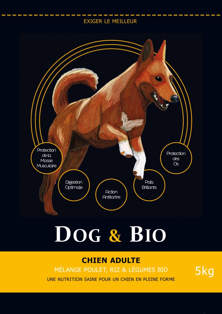
The assignment: create an illustration to showcase the benefits of Dog & Bio’s dog food, using a realistic image that reinforces the seriousness of its message while offering a quick, easy read.
The brief for this assignment was quite vague, allowing the illustrator to choose the breed of dog and the angle of view (front, side, three-quarter, etc.). The only thing that was imposed was that it needed to be in a realistic, but not scientifically accurate, style.
This brief was separated into two phases, much like a real project would be. A first preliminary design phase to present the initial research to the imaginary client and submit several different ideas. Then a second finalisation phase.
Preliminary Design Phase
The aim of this phase is to research the subject and present different creative leads, from which the client will choose one to take to the finalisation phase.
Research and rough sketches
I began by researching different dog breeds and their typical personality traits. I collected numerous reference photos. I also checked which dogs came up frequently on other dog food packaging.
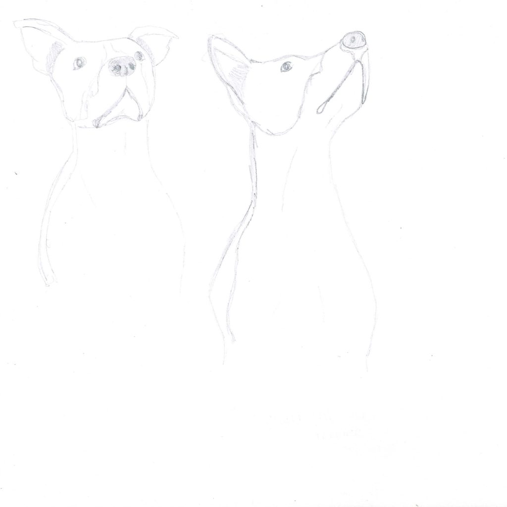
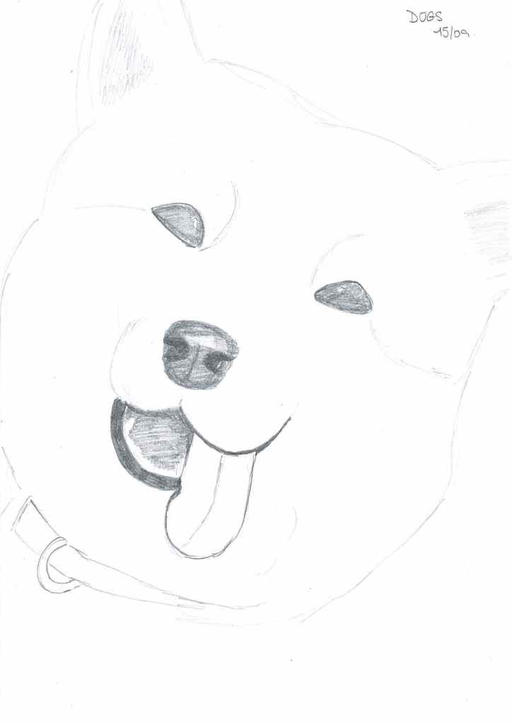
After this, I completed a certain number of rough sketches to get my hand used to drawing dog features. I tried different expressions: smiling, serious… I also varied between only portraits and full-body sketches.
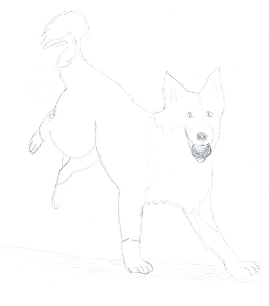
Seeing that most other dog food packaging either presents a photo of a dog running, a dog sitting, or just a dog’s bust, I decided these would be the three creative leads I would suggest to my “client”.
From sketches to mood boards
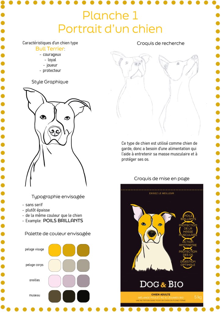
The first mood board included a Bull Terrier dog, in a more stylised design. It was still realistic in terms of proportions, but the lines and colours were modern and in line with the brand. The decision to present the dog in a serious portrait was intended to mirror the brand’s image.
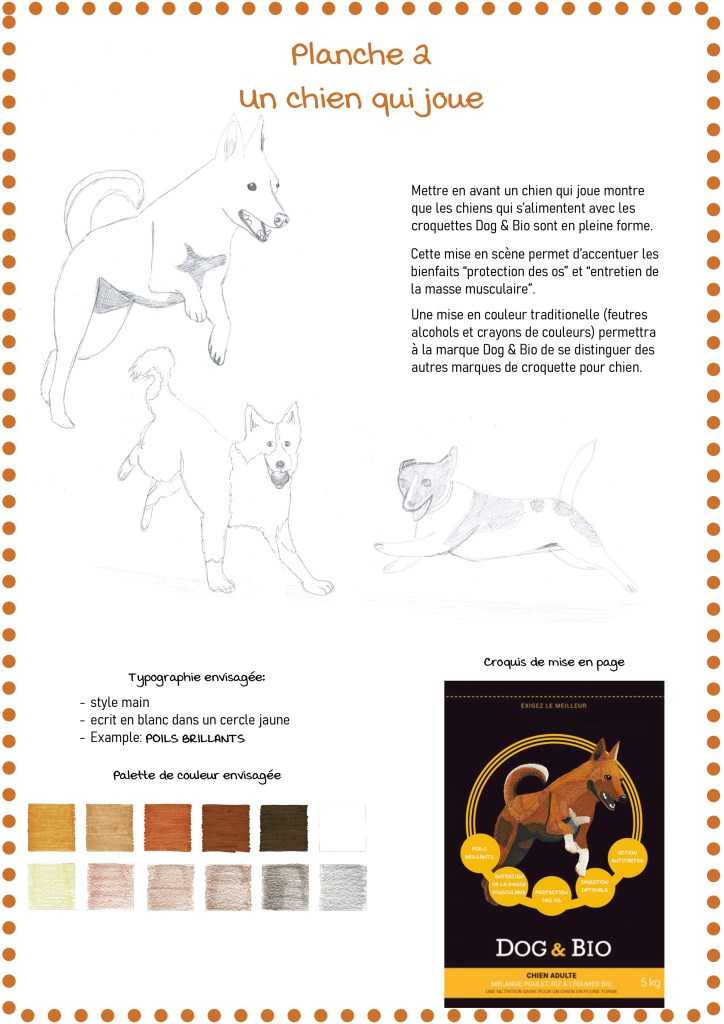
The second mood board was more about what the dog was doing – running, having fun – than the breed itself. I wanted to show through the dog’s playfulness that this brand of dog food was healthy. The aim of this illustration was to draw a dog as realistically as possible, without crossing into hyperrealism.
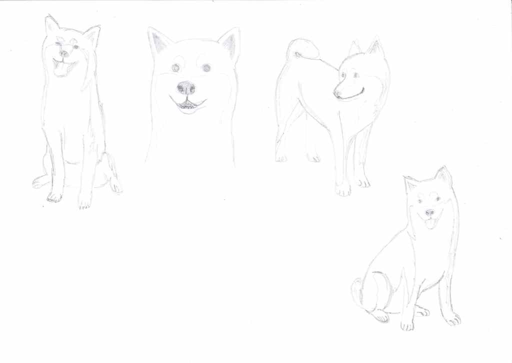
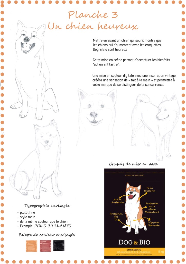
The third mood board was of a Shiba Inu, chosen for its fluffy, huggable appearance. I chose a wide-angle, full-body pose. It was drawn more in the spirit of a scientific textbook, proportionally correct, but slightly stylised.
The Finalisation Phase
After receiving feedback from my tutors, I chose to pursue the second mood board. This, I felt, was the most appropriate creative lead regarding the initial brief.
I decided to use traditional media to colour the drawing. I used coloured pencils and alcohol markers on A3-sized paper. It stands out from other packaging, as most use photos and not illustrations, and the use of traditional media gives the illustration an authentic warmth.

Drawing the dog and colouring it was only one third of the work. The goal wasn’t to create a perfectly realistic dog, but an illustration that visually communicates the product’s message.
The downside of using traditional media is that it must be digitised afterwards. This process can sometimes prove to be painstakingly long. Between cleaning up the scan to adjusting the colour balances, it takes time to get the scan looking as good as the original.
Then there’s the layout to think about. The dog needs to be integrated into the packaging.
Takeaway
This project taught me so much. Here are the key things it reinforced for me.
With my coursework, I’ve learned that being good at drawing isn’t enough to be a good illustrator. You also need to learn to tell a story through an image, not to mention the more technical aspects of page layout, typography…
This project took much longer than I initially thought. I spent nearly 30 hours from the brief to the final illustration.
I spent 19 hours on the preliminary design phase:
- 8 hours of research and sketching
- 11 hours to create 3 unique mood boards which each answered the client’s brief
I spent 9 hours on the finalisation phase:
- 2.5 hours colouring with felts and coloured pencils
- 3.5 hours digitalising my traditional drawing
- 3 hours working on the layout of the final illustration
The most challenging part of this project was narrowing down the creative leads. The brief was relatively open, giving the illustrator a lot of creative freedom. However, sometimes, having so much freedom is like a double-edged sword. You can get lost in the possibilities.
But that’s also the beauty of illustration. The endless possibilities.
I love sharing real, unfiltered parts of my creative process, so if you enjoy these behind-the-scenes posts, stick around — there’s more coming soon.
And if you’d like to follow along as I grow as both an illustrator and author, you can sign up for my newsletter here.
Until next time, have an inspired week 😊




Leave a comment